Color Harmony in Photography
Preface
Color harmony refers to the balanced and aesthetically pleasing interaction of colors. Artists and designers make use of these harmonies in order to achieve certain moods or aesthetics. It has been a topic of extensive study throughout history, but only since the Renaissance it has seen extensive codification.
Color Models
Applying color harmony requires a well established coded framework. This is provided by the various color models. Most of them use a method similar to the human eye. They use a number of primary colors, i.e. colors that cannot be produced by mixing other colors. All the rest are produced by mixing the primaries.
Some of the most common are:
RYB model (Red – Yellow – Blue)
RGB model (Red – Green – Blue)
CMYK model (Cyan – Magenta – Yellow – Black)
RGB color model
In this model the primary colors are Red, Green, Blue. All other colors are obtained by mixing the primaries.
This is the color model used in camera monitors and sensors.
In the image below, a sensor with a Bayer filter is presented on the left while a sensor with an X-Trans filter on the right.
The X-Trans arrangement is only used by Fujifilm, while the Bayer arrangement is used by all other manufactures.
In the image below, a magnified view of a TN screen is being presented, showing the arrangement of the pixels.
CMYK color model
In this model the primary colors are Cyan – Magenta – Yellow – Black. The use of black is needed because, in practice, the simultaneous mixing of the primaries does not yield pure black. All other colors are obtained by mixing the primaries.
This is the color model used in digital printing.
RYB color model
In this model the primary colors are Red, Yellow, Blue. All other colors are obtained by mixing the primaries.
This is the color model used in classic painting.
Which color model?
There is no better or worse color model. Each has its own strengths depending on different situations. Due to the traditional use of the RYB model in painting, which is a source of inspiration in photographic frame composition, this blog will be based on the RYB model.
Color wheel
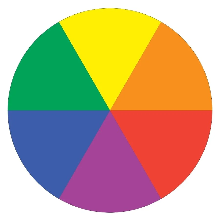
An aid to understand color harmony is the color wheel.
Colors in it are grouped according to:
their relationship, where they are divided into primary, secondary and tertiary.
their intensity, where they are distinguished as cold or warm.
their position on the color wheel, they are distinguished into complementary, proportional or monochromatic. These combinations make up the most widespread color harmonies.
Primary colors
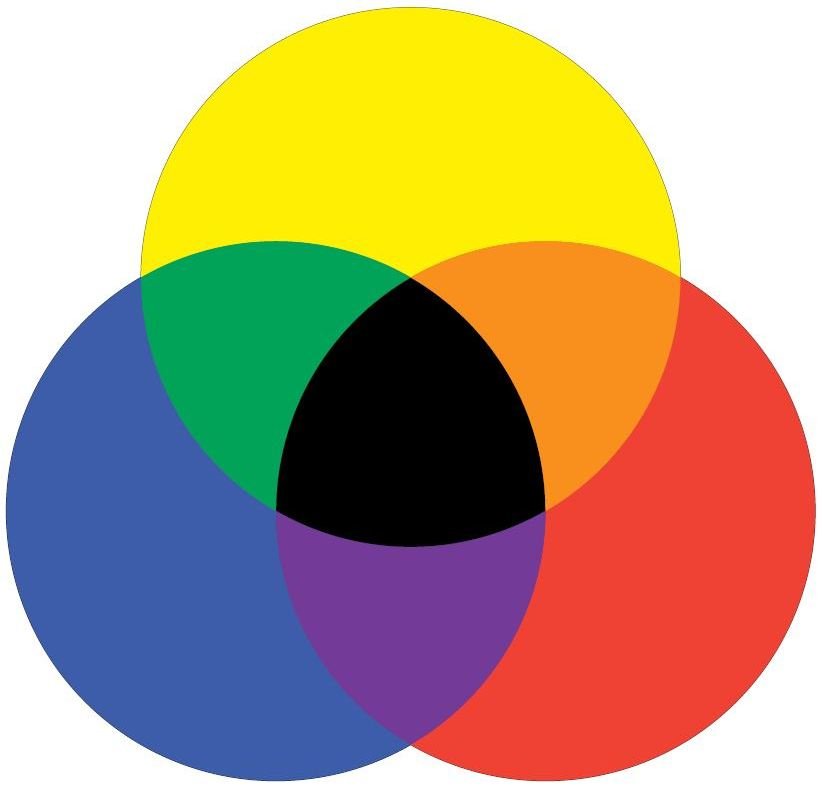
As mentioned above, in RYB model the primary colors are Red, Yellow, Blue. These colors cannot be produced by mixing other colors. Instead, all other secondary and intermediate colors are derived by mixing the three primary colors.
Secondary colors
Secondary colors are green, orange and purple.
Each secondary color is created by mixing two primary colors, those to its left and right on the color wheel. Thus, mixing red and yellow gives orange, mixing yellow and blue gives green, and mixing blue and red gives purple.
This is depicted, in a more illustrative way, in the image below.
Tertiary colors
Tertiary colors are produced by mixing a secondary with a primary color, those to the left and right of it on the color wheel. An example:
Cool colors
All the shades on the color wheel next to blue, green and violet are considered cool colors. They are named after the shades of ice and water and are often associated with feelings of calm, relaxation or even melancholy. Imagine the calm of a deep blue ocean or the serenity of a forest. Photographers often use these hues to bring out a mood of relaxation or contemplation and detachment.
Claude Monet used cool colors to give the painting "Branch of the Seine near Giverny" a peaceful feeling.
Picasso, in his Blue Period (between 1900 and 1904), painted essentially monochromatic paintings in shades of blue and blue-green, only occasionally warmed by other colors and this symbolized an emotionally charged period of his life.
In the photos below, the color palette is dominated by cool shades.
Warm colors
Warm colors, like reds, oranges, and yellows. These often bring feelings of warmth, energy, and excitement. Think of a fiery sunset or the glow of autumn leaves. In photography, the use of these colors can create an upbeat, vibrant mood, making the viewer feel closer or more engaged with the image.
An example of the use of a warm color palette in painting is the painting "Sunflowers" by Vincent van Gogh.
and the painting “IN THE WARM FOG” by Leonid Afremov.
In the photos below, the color palette is dominated by warm shades.
Common color harmonies
As mentioned above, color harmony has to do with the balanced, and aesthetically pleasing, interaction of colors. It has been established that certain color combinations are instinctively pleasing to the eye. The common are:
Complementary colors
Analogous colors
Monochromatic colors
Complementary colors
These are colors opposite each other on the color wheel. This color harmonies are dominated by red-green, orange-blue and purple-yellow combinations.
The high contrast of complementary colors creates a vibrant look especially when used in full saturation. Just like the strongest contrasts, complementary colors tend to enhance each other. Complementary color combinations are used to highlight an element within the photo.
In the photos below, the color palette is dominated by complementary colors.
Analogous colors
Colors next to each other on the color wheel are called analogous. Color harmonies with complementary colors are dominated by combinations of green – yellow, yellow – orange, orange – red, red – purple, purple – blue and blue – green. They are often found in nature and are harmonious and pleasing to the eye. They usually match well and create peaceful images. In these compositions it is good for one color to dominate and a second one to support.
In the photos below, the color palette is dominated by analogous colors.
Monochromatic colors
Monochromatic is any photo that contains only the shades and tones of a particular color. The emphasis on just one color projects a specific aesthetic and mental mood, with a minimalist and abstract approach. Structures, geometries and patterns can be emphasized through the good use of light and contrast


